Anyway, the concept of the first one is good - mix humour into it, and it gains a lot. The execution needs a little work.
We need banners...
Moderator: Crew
-
SFault
- Tycoon
- Posts: 283
- Joined: Fri Aug 11, 2006 11:14
- Location: Atlantis


-
Scythe

- Winner of CWF review contest!
- Posts: 3165
- Joined: Sat Mar 04, 2006 12:59
- Location: Nova
-
Maz

- Admin emeritus
- Posts: 1938
- Joined: Thu Mar 16, 2006 21:11
- Location: In the deepest ShadowS
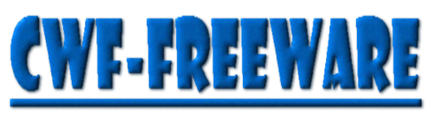
I knew that if I just place ugly enough images, I'll eventually get better ones done by members  You just managed to avoid my rainbow-coloured, ill-sized, new dimension of uglyness - banners
Perhaps I should try that with the layout too?

EDIT: Height of the CWF-FREEWARE could be a lil bit smaller. I hope width is ok so page won't be scrollable with smaller resolutions.
Perhaps I should try that with the layout too?
EDIT: Height of the CWF-FREEWARE could be a lil bit smaller. I hope width is ok so page won't be scrollable with smaller resolutions.
My obsession network related programs and protocols has created these:
epb - Ethernet Packet generator (and more)
nsn - Network status monitoring tool for linux
thongs-sniffer - network sniffing and traffic analyzing tool + ethernet packet crafter for linux (derived from nibbles)
nibbles - UDP print listener + something else
Foreverlasting projects:
http :// m-a-z.github.io/aMazPong - MazPong - revived??
-
Chroelle
- Admin emeritus
- Posts: 9870
- Joined: Fri Feb 17, 2006 9:19
- Location: Location, location...
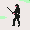
Looks really good SFault. I think that might also be some hint of style as to where we want to go with design. It looks very "game-ish" to me.
Currently testing Life version 2.9 (With added second child)
(Beta testing in progress)
www.paed-it.dk - My blog in Danish
Clothes make the man. Naked people have little or no influence on society.
--Mark Twain
(Beta testing in progress)
www.paed-it.dk - My blog in Danish
Clothes make the man. Naked people have little or no influence on society.
--Mark Twain
-
Pater Alf

- The Steel Spine of GameHunters
- Posts: 7649
- Joined: Thu Apr 13, 2006 23:09
-
Maz
- Admin emeritus
- Posts: 1938
- Joined: Thu Mar 16, 2006 21:11
- Location: In the deepest ShadowS
I just thought I'll tell you light stylers, that SFault's banners look even better with black background 
My obsession network related programs and protocols has created these:
epb - Ethernet Packet generator (and more)
nsn - Network status monitoring tool for linux
thongs-sniffer - network sniffing and traffic analyzing tool + ethernet packet crafter for linux (derived from nibbles)
nibbles - UDP print listener + something else
Foreverlasting projects:
http :// m-a-z.github.io/aMazPong - MazPong - revived??
epb - Ethernet Packet generator (and more)
nsn - Network status monitoring tool for linux
thongs-sniffer - network sniffing and traffic analyzing tool + ethernet packet crafter for linux (derived from nibbles)
nibbles - UDP print listener + something else
Foreverlasting projects:
http :// m-a-z.github.io/aMazPong - MazPong - revived??
-
SFault
- Tycoon
- Posts: 283
- Joined: Fri Aug 11, 2006 11:14
- Location: Atlantis


-
Chroelle
- Admin emeritus
- Posts: 9870
- Joined: Fri Feb 17, 2006 9:19
- Location: Location, location...
I will dig myself into some bannerwork during the next week or so. I am hoping to create something that looks good for Spaneks style.
Currently testing Life version 2.9 (With added second child)
(Beta testing in progress)
www.paed-it.dk - My blog in Danish
Clothes make the man. Naked people have little or no influence on society.
--Mark Twain
(Beta testing in progress)
www.paed-it.dk - My blog in Danish
Clothes make the man. Naked people have little or no influence on society.
--Mark Twain
-
Chroelle
- Admin emeritus
- Posts: 9870
- Joined: Fri Feb 17, 2006 9:19
- Location: Location, location...
For the new look I decided to try some stuff out with some banners.
I tried meddling with this site where I created some good stuff before.
http://cooltext.com/
Please try it out to see if you have some ideas. I will also try and work with a specific logo idea.
I tried meddling with this site where I created some good stuff before.
http://cooltext.com/
Please try it out to see if you have some ideas. I will also try and work with a specific logo idea.
You do not have the required permissions to view the files attached to this post.
Currently testing Life version 2.9 (With added second child)
(Beta testing in progress)
www.paed-it.dk - My blog in Danish
Clothes make the man. Naked people have little or no influence on society.
--Mark Twain
(Beta testing in progress)
www.paed-it.dk - My blog in Danish
Clothes make the man. Naked people have little or no influence on society.
--Mark Twain